We’ ve been using the recently completed shot 18 as one of our first compositing tests, and figured we’d share the work in progress.
Shot 18, compositing layers
It’s only basic lighting so far, but the ability to adjust contrast and saturation in layers allows us to really bring out the comic-book look we’re going for.
For a while now, the Ottoman team has been using Google Hangouts for our weekly videoconferences. The narrow banner across the top of the Hangout page always looked a bit bare, so we filled it in with images of whatever we were slated to discuss that week.
Over time, these little strips have become a kind of kaleidoscope of progress, showing colorful glimpses of the project as it develops. Here are some of our favorites.
Scarab mecha: heavy armor textures.Seq. 3, shot 1.1 – The Scarab enters the ruins.Seq. 3, shot 4 – The Ottoman reaches for a flare.The medina, from on high.Seq. 3, shot 13 – The scorpions close in.Seq. 3, shot 17 – The Ottoman races back to his mecha.The medina: radio station textures.Seq. 3, shot 29 – The Ottoman’s wife awakes to strange noises.
Now that our mecha is rigged, it’s time to test it out. But how does a six-legged vehicle get around, anyway? Animator Mark Medrano assembled this collection of walk-cycle tests, to help answer that question.
Tripodal, sequential and bipedal animations by Mark Medrano; gallop animation by Kyle Bernard High-res video: HexaWalkComparison-HD.mp4 (30MB)
Upper left: tripodal gait
This is a very common gait in both insects and robotics as it is statically stable, meaning that the machine can stop at any point during the step cycle and not fall over. As long as its center of mass remains within the triangle formed by the feet on the ground, the machine can maintain some margin of static stability, even at fast speeds. A cockroach can travel nearly ten times its own body length per second before its gait becomes unstable.
Upper right: sequential gait
This is also a statically stable gait, even more so than the tripodal one, since only one foot at a time is ever off the ground. This gait also occurs in nature but tends to shift from one side of the body to the other, sometimes lifting legs at random rather than the specific pattern displayed in the render. However, the increase in stability of this gait comes at a great cost of speed. Since the forward leg must travel much faster than the legs pushing back, actuator limits will kick in long before the machine can get up to its top speed.
Lower left: tetrapodal gait
This gait can be seen on insects whose legs have been hurt. Despite it being an unnatural walk, their nervous system automatically adapts. For our purposes, the legs don’t have to be damaged for this gait to be useful. If mecha-scarab needs to carry a heavy object, we can fall back on the same leg sequencing that a quadruped uses. This gait is referred to as dynamically stable: the two feet left on the ground don’t provide a solid base, so the machine needs to constantly adjust to keep from tipping over while it’s walking.
Lower right: gallop
We’re comfortably certain that no real-world insect walks this way. Pretty adorable, though!
Bret Bays, the Ottoman project’s Character Technical Director, has been rigging up a storm lately. As animation ramps up, his character controls are constantly being put through their paces. Despite an endless torrent of extreme poses and feature requests, Bret’s meticulous devotion to his work shines through. We thought it would be good to share a profile of the man and his work.
The Ottoman rig in action
On getting started with the team
I came to Ottoman project when I met [Animation Director] Dimos back in summer of 2009. I was attending Animation Mentor at the time, and he was a mentor there as well. We had sort of met through C4D beta testing, but when he found out I was at AM we began to talk.
When I first started, reusing rigs was the biggest challenge. There was no system in place. Python wasn’t implemented yet (in R11) and I didn’t know COFFEE, so scripting it was not an option for me. R13 helped solve that issue, but it had its own quirks when trying to easily and quickly rebuild rigs.
On the rigs themselves
They have a lot of fundamentals. They’re sturdy. There’s always stuff I’d like to add, or do differently, as time goes on, but if I kept going back and revising, the short would never get animated. I’m glad I got it working as a template though. Might be safe to say I’m the first person to create a face rig template in Cinema 4D.
I was pretty proud of the Scorpion Mecha rig. That was a challenge, and I like the dynamic, springy-ness of the cockpit. Even if the setup for it is not anything particularly special, it was something I had never done before.
On staying motivated for long stretches of time
I haven’t really ever been a part of a team that finished something, and I haven’t had much opportunity to show off my work. All of the short ideas I have had, I haven’t been able to materialize much. I felt like there was so much potential with this short, and we’re getting so far, that someday I’ll be able to point at it and say, “Hey, I helped make that happen.” This project has led to new job opportunities, so I just want to keep at it and see it through.
Advice for aspiring TDs
Just keep practicing. Rig as much as you can and learn to script so you can automate things. Your life will be significantly easier if you can automate some of the more tedious and boring tasks.
One of the main discussion topics at our Ottocon get-together was the slow pace that comes with collaborating over the internet. We’re all working other freelance or full-time jobs, and it’s tough for the team members to get prompt feedback, or to keep tabs on how the work is going. The team already relies on tools like Facebook, Basecamp, Google Plus and SVN to exchange files and information, but the sheer volume of information traffic makes it hard to filter and prioritize. So, to deal with the signal-to-noise issues, we created the Ottoman Status Board.
Tracking the Kickstarter clip on the Ottoman status board
Heavily inspired by Panic’s Status Board, this colorful progress readout allows the animators to get a snapshot of the project’s status at a glance. It also allows Dimos, our animation director, to see who’s waiting for feedback, and where their latest files are. It’s been a rousing success so far—only a few days in, and we’re already seeing a quicker turnaround on feedback and revisions. Over the coming weeks, we’ll be looking to add new info-readout components based on animator requests.
Last weekend, the entire Ottoman animation team converged in San Francisco for our first-ever in-person get-together. Many of us know each other only through videochat, and it was a blast to finally shake hands and geek out about spline controls and run cycles. Special thanks to everyone who traveled by plane, train and automobile to be there. We’ll have to do it again next year!
A collection of hand-crafted maquettes of the mecha and characters.
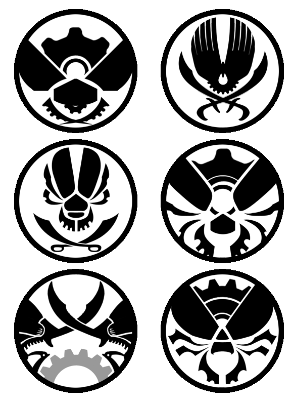
One of the side projects we’ve got going on at Ottoman HQ is the design of the “Insect Mecha Battle” Tournament logo, which adorns the flags and banners of the “Ottoman” world. The ideal logo design would serve as a visual signature for the project as a whole, while still fitting the art style of the film. We aimed for a vintage 1960s silhouette design, taking special inspiration from the work of Saul Bass.
We began with some core motifs: beetles, crossed sabers, gears and skulls, and tried to see what we could distill into a striking and iconic emblem. The six designs below are some of the rough concepts that we’ve developed along the way.
With luck, we’ll have a finished design to unveil within the next few weeks! Stay tuned…
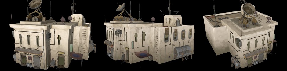
While working on the high-poly medina environment upgrade, modeler David Alvarez has pulled out all the stops with this collection of whimsical machines, doorways, fuel tanks and satellite dishes. Although a number of the models are refinements of existing low-res props and machinery, some of the best are his own creations.
So delightful, we just had to share!
Modeling by David AlvarezModeling by David Alvarez