The creation of the Scarab, part 1

The Plastic Scarab

Like the Scorpion, the Scarab started out as a physical model, even before any concept artwork was drawn up. This prototype that art director Matt Evans sculpted out of a mini trash-bin lid, salad tongs and foam rubber became the foundation for all the designs that followed:

The plastic Scarab prototype
Sculpture by Matt Evans

Even late in the modeling stages, the ability to refer back to the base design was instrumental in keeping the Scarab from drifting too far from our original vision.

The pencil stage

Dermot Walshe was the first to take a crack at adapting the prototype Scarab into dieselpunk form, with this Jeep-like concept:

Scarab with grayscale wash
Artwork by Dermot Walshe

Unlike his Scorpion designs, however, we felt that Dermot’s take on the Scarab was perhaps a little too aggressive. Moreover, although the Scarab is supposed to look like it’s built out of scavenged and retrofitted machinery, the shape still needs to be instantly readable, even in motion. The Scarab’s silhouette was in need of some major streamlining.
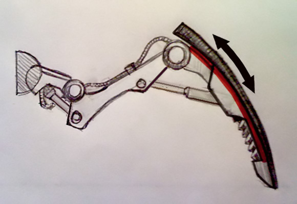
The Ink Stage

Concept artist Roger Oda, known for his precise, technical inking style (many people assumed his drawings were celshaded 3D renders) was brought in to do precisely that. His rounded, stripped-down Scarab preserved a number of elements from Dermot’s version, while also sporting some accessories of his own—the spring-heel shock absorbers, squared-off toes and secondary headlights were all incorporated into the final model.

Scarab design by Roger Oda
Artwork by Roger Oda

With the addition of David Ward’s armor designs, we were ready to make the move to 3D…

Our first walk cycle

Sure, it’s only a 1-second walk cycle of an untextured model with simplified clothing, but honestly, we couldn’t be more proud.

[qt:https://the-ottoman.com/blog/wp-content/uploads/2010/09/Ottowalk.mov 580 680]

  • Character modeling: Jim Talbot
  • Rigging: Bret Bays
  • Animation: Nikolas Karatasakis
  • Technical direction: Charles Wardlaw

Secrets of successful art direction: diagrams

Freelancers can’t read your mind.

Most of the time, that’s a good thing. But when you’ve got revisions to make, you might find yourself wishing that they could. Art direction, after all, deals in abstractions. But a freelancer needs specific instructions to carry out, no matter how clearly you can visualize the final product in your head. It’s tempting to rely on written instructions, since they’re the easiest way to explain your vision. But they can often lead to frustrating gaps in communication. You end up going in circles that are more about word choice than art direction:

CLIENT: I said I wanted the car to be sleeker, but it looks like you just made it rounder.

FREELANCER: Right, I figured that would make it more aerodynamic. You did say “streamlined” when we talked over the phone.

CLIENT: Yeah, but I meant streamlined as in, more like a rocket.

FREELANCER: I can make the car narrower, if you like.

CLIENT: No, it should stay the same width, I just want it more rocket-shaped.

FREELANCER: So you want the car to be pointier?

CLIENT: No, just sleeker!

(Repeat until client runs out of money.)

If you find this happening a lot, consider taking a step back and making some diagrams. Yes, they’re time-consuming to make, and you may feel like you shouldn’t have to spell things out for professionals who take art direction for a living. But you’ll find that diagrams will actually save you time in the long run. Your revisions will get turned around faster and more accurately. It’s no mystery, really—your freelancers work visually. A diagram provides them with instructions in their native language.

Take the Scorpion Rider, for example. Our art director had previously sculpted a maquette illustrating the changes he wanted to see made to the existing 3D model. You’d think no further reference materials would be necessary, but that’s where we get back to mind-reading. A sculpture is still just a tool. We still needed to explain what it meant.

The modeling went well overall, but arms and hands are notoriously difficult to sculpt in any medium. We were getting close to what we wanted, but we weren’t all the way there yet. To spare ourselves a lot of back-and-forth over the intended meanings of “cadaverous,” “sinewy,” “boxy” or “muscle definition,” the art director made the pair of diagrams below.

A diagram of the Rider's arm musculature
Artwork by Matt Evans. 3D revisions by Sandi Dolšak

Diagram of the hand layout
Artwork by Matt Evans

These diagrams are much more than just detailed views of the maquette. The maquette shows the modeler what to do. The diagrams show how. It’s a critical distinction, and for a freelancer, probably the next best thing to telepathy.

The creation of the Scorpion, part 4

As we headed into the Scorpion mecha’s final modeling phase, it was time to unify all the various contributions to the design over the months. Using the cardboard Scorpion mockup as a foundation, we went through all the prior concept work, taking note of the details we wanted to preserve from each design. The final Scorpion mecha would have:

  • The thick, axe-like pincers from the cardboard version
  • The central-pillar cockpit controls from Dermot’s concept
  • The giant flywheel and spiked tail from Roger’s concept

Scorpion curves.jpg

The last stage of the process was the above diagram from the art director, showing the invisible lines formed by the Scorpion’s proportions. It was vitally important that these proportions be preserved when bringing all the components together. It took many designers and modelers countless rounds of revisions to create the Scorpion mecha, but I hope those of you reading this would agree that the results were well worth the effort.

Scorpion mecha, 3/4 view
Model by David Alvarez, Sandi Dolšak and Magne Lauritzen
Scorpion mecha, front view
Model by David Alvarez, Sandi Dolšak and Magne Lauritzen

The creation of the Scorpion, part 3

David Alvarez' initial Scorpion model
Model by David Alvarez

Our Scorpion was finally in 3D form, and it looked pretty neat. But something didn’t feel right. This was supposed to be an unholy offspring of a scorpion and a motorcycle, only it looked more like some sort of mobile vending machine. With a tail.

The art director and I determined that there were three areas of improvement we needed to tackle.

Problem 1: The cockpit

One of the signature aspects of a motorcycle is the riding position. Our current cockpit looked more like it came from a mini-submarine, or an autogyro.

The original Scorpion cockpit looked like an autogyro's.
Model by David Alvarez

To fix it, we pulled the seat out of the cockpit to work on it in isolation. We studied a ton of motorcycle reference photos, especially the low-rider chopper style popularized by Easy Rider, and after about a dozen rounds of trial-and-error revisions, settled on the design below. We knew we’d have to rebuild a new cockpit shell around it, but the seat was perfect.

The seat design went through at least ten revisions.
Model by David Alvarez

Problem 2: The segments

Insects have a very recognizable body shape and locomotion style. Our current Scorpion model had none of the segmentation that we associate with real-world scorpions, and would probably not scuttle across the ground in an insect-like way.

We needed to break the cockpit apart from the main engine/body, and connect the two pieces with a flexible shock-absorbing junction. This would allow the two sections to move independently of each other, allowing the animators to create a more unsettling, scorpion-like walking style.

It was a daunting task, creating a junction design that was both powerful enough to support the cockpit and its oversized claws, but with a wide enough range of motion to allow for both lateral and axial movement. It ended up being one of the last pieces of the Scorpion to be built, due to its complexity.

Twin rotating forks, double shock absorbers, triple socket actuators
Artwork by David Ward

Even now, we’re not entirely sure how we’re going to rig it.

Problem 3: The tail

The plated tail design had been introduced in the earliest concept sketches, but over all the revisions it had gotten increasingly slender. By the time it was in 3D form we’d taken to calling it “the watchband.” The art director felt it wasn’t compatible with the heavy, brutal look he was after. So, he went back to his workshop and came back with the most brutal-looking tail design imaginable.

Matt Evans created a massive plated tail.
Sculpture by Matt Evans

The Scorpion design was complete. All that was left was the remodeling.

Continued in part 4…

The creation of the Scorpion, part 2

Two photos of the cardboard Scorpion mecha
Sculpture by Matt Evans

The first thing we did to make the Scorpion more menacing was to beef up the limbs. We decided that the legs would consist of a piston-driven set of joints attached to a large shield piece and an integrated shock-absorption system. The claws, rather than oversized shears, would be immense axe-like crushers. Matt updated his cardboard mockup with the new additions.

shock-absorber-path.jpg

Next, we reached out to Roger Oda, a concept artist specializing in precise, hand-rendered linework. Roger went all-out on the detailing, building up an elaborate structure of pipes, gears, hoses and rotors. He even introduced a hefty flywheel at the base of the tail, to lend the Scorpion that extra dieselpunk touch.

Concept art of the Scorpion mecha
Art by Roger Oda

We finally had enough detail to move to the 3D modeling phase. But we soon discovered that bringing all the pieces of the Scorpion together would prove more challenging than we expected…

Continued in part 3…

The creation of the Scorpion, part 1

Prototype One

The initial concept for the Scorpion wasn’t much to look at. Built by art director Matt Evans out of MDF and wire, it had no legs, cardboard pictures for claws, and a paper clip where the stinger should be. But it established the basic proportions of the beast, and that was enough to get started with.

Cardboard Scorpion mecha mockup
Sculpture by Matt Evans

We knew we wanted the Scorpion to ride like a motorcycle—a monstrous, eight-legged motorcycle. We’d given the Rider a cruiser riding position and an exposed chopper-style engine. We just needed someone who could fill in the details and bring the Scorpion to life.

The pencil stage

Concept artist Dermot Walshe had a whole section of motorcycle art in his portfolio, so we knew he’d be a good fit. Indeed, his take on the Scorpion was a marvel of exhaust pipes, chain gears and springs.

Scorpion mecha concept art
Artwork by Dermot Walshe

He even whipped up an animated “harpoon” attack for the battle scenes!

[qt:https://the-ottoman.com/blog/wp-content/uploads/2010/06/scorpion-attack.mp4 580 336]

But something was off. Even with the multitude of leg designs that Dermot provided, the Scorpion just didn’t seem aggressive enough. We decided to make some adjustments…

Continued in part 2…

Meet the competition

They may not do much besides mill around in the background, but the rival mechanic/pilots in the Tournament are crucial in setting the film’s tone during the opening scenes.

Concept artist Sergey Popov really nails the look, with this imposing trio of opponents:

Rival mecha pilots
Artwork by Sergey Popov

Mecha-flea!

From the list of “mecha I would not want to encounter in a dark alley”…

mecha-flea!
Model by Magne Lauritson

Mecha-flea is based on this lovely painting:

Mecha-flea concept painting
Concept art by Vincent Morin