Storyboarding complete!

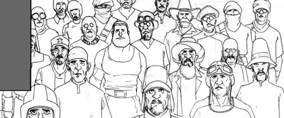
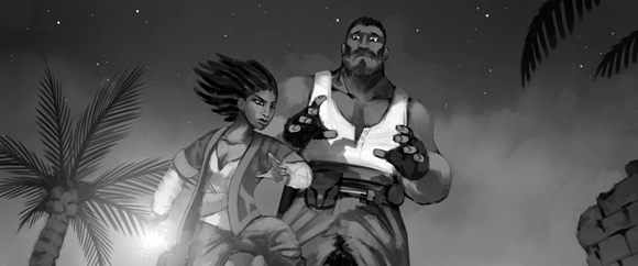
Having received the last batch of revisions this morning, the storyboards for The Ottoman are finally finished. The recruitment process for storyboard artists began over a year ago, and it eventually took five people to produce the over 700 panels that depict the events of the short film. (Thanks once again to Davin Cheng, Victor Lopez, David Ward, Vincent Morin and Ian Cherry.)

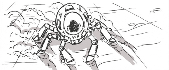
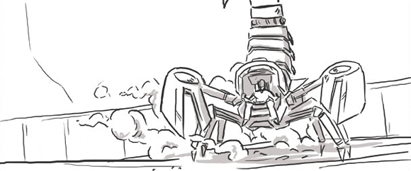
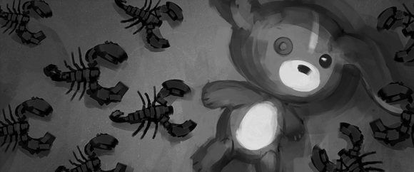
Below, in no particular order, are a few of my favorite panels from the collection.

storyboard panel by Victor Lopez
storyboard panel by Vincent Morin
storyboard panel by Ian Cherry
storyboard panel by Vincent Morin

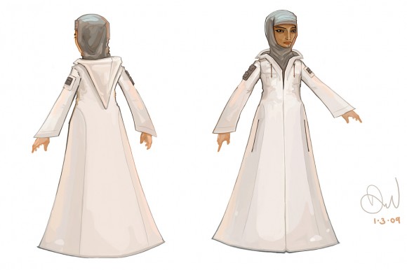
The Ottoman’s wife

The Ottoman’s wife is the latest addition to the Concept Art gallery, the last of the four main characters to be added. Putting together a plausible Arabic steampunk ensemble was tough—corsets are right out, and goggles make her look like a pilot. In the end we went with a Moroccan-style djellaba, updated with some utility pockets and hoodie drawstrings.

The Ottoman's wife
Artwork by David Ward

There’s also an indoor outfit in the works, but the hair is proving difficult to model.

On directing: live-action vs. animation

As a director with a film background, I’m constantly struck, while working on this project, by how differently live-action and animated films are made. Here’s the distinction as I see it:

Live-Action Film

1. Work out the performances
2. Shoot it
3. Edit

Animation

1. Edit
2. Shoot it
3. Work out the performances

This is admittedly a subjective view. After all, there are plenty of live-action directors who plan their films around the cinematography and shoehorn the actors in later. But filmmaking as I know it is about creating performances, capturing them, refining them and assembling the results for maximum impact. So I definitely find myself struggling with the topsy-turvy world of animation production.

In animation, working out the timing of shots is the first thing you do. Even before you have final characters to shoot or final sets to shoot them on, you’re expected to time your storyboards and lock down your shots. You’ve effectively edited your entire animation together before you have any footage at all. From there, you work out blocking and camera angles, and only then can you begin to work on the animated performances, carefully customized to your previously chosen camera angles, and even to your previously determined shot lengths.

Of course, there are perfectly good reasons why these two workflows differ so much. In live-action, performance is a fluid, mutable thing. If a director expects to capture the best of what the actors are capable of delivering, that director has to be willing to rethink the film’s shot plan—or even the script—based on what happens in the moments between the lines. In animation, the audio track that drives an animated character’s performance is recorded and timed long before an animator even sits down to start working. Moreover, while it’s considered perfectly reasonable to shoot twelve takes of an actor’s performance and use only one, it’s a tremendous waste of resources for an animator to spend time animating anything that ends up on the cutting-room floor.

The resulting gap between the two approaches is substantial, and there’s no easy way to get the best of both worlds. The solution I’ve put together on this project is a hybrid approach that runs like this:

Live-Action-Style Animation

1. Storyboards / Animatics
2. Rough animation using low-res proxies (pre-visualization)
3. Edit
4. Performance (final animation)

It’s not the most efficient system in the world, as it effectively requires you to animate the film twice, once before the cut and once after. Even then, it’s less than ideal—most of the acting is still added after the timing is already locked down, which means there’s not much room to shape the flow of the film around the performances. But it’s the best method I’ve been able to come up with, given my preferred way of directing and the constraints of working with an entirely internet-based team.
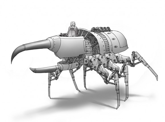
Rhino-beetle mecha

Justin Oaksford brings us this wonderful rhino-beetle mecha design. I’m really looking forward to seeing it recreated in 3D, although our modeler probably isn’t.

Concept art by Justin Oaksford

Working with concept artists: getting more for your $$

The previous installment covered ways of lowering costs when negotiating a contract. But the director’s work doesn’t end there! Now that you’ve settled on a limited budget, you’ll need to get the most out your freelancer’s limited time.

It’s important to point out that your freelancers are not the enemy here. They want to give you the best possible artwork in the shortest amount of time, which should also be what you want. The key to achieving this? Communication. You, the director, need to convey to your freelancer precisely what your project needs to move forward. And precision is the word, because you can’t afford to have your freelancers stumbling around trying different styles and configurations on your dime.

To steer your freelancers to the “right” designs/concepts/models, you’ll need every tool at your disposal: e-mails, diagrams, reference art, video chats—whatever it takes.

Here are some other techniques you can use to get better work, faster:

  • Have your freelancers keep their work fast and rough through multiple rounds of revisions. This is often hard to do—freelancers often want to jump to the polishing stage as quickly as possible, because for them, that’s the fun part. But keeping everything at the “pencil” stage will allow you to make revisions faster and more frequently, and it’ll also keep both of you from getting distracted by the details when you should be focused on the fundamentals.
  • Start building a collection of reference art long before you start contracting anyone. For one thing, you’ll be in a better position to judge potential freelancers’ portfolios in the context of what you’re looking to see. For another thing, you’ll be able to hit the ground running once your freelancer is on the clock. Every time you find yourself saying “I don’t know, what do you think it should look like?”, you’re wasting money.
  • Keep your contracts short-term, one assignment at a time. Discard freelancers who can’t get you what you want in a timely manner, and stay loyal to the ones who can. As your project unfolds, the quality of the work will increase as you fill your roster with better and better artists.

If this sounds like a lot of work, you’re right. You are essentially trading your time for money.

March of the pants

It’s our first animation test!

This one is the brainchild of Jasper Hesseling, who’s been tasked with finishing the clothing/detail modeling of the main characters. To see how his baggy pants geometry would deform while in motion, he set up this quick animation test.

The results were better than we’d been expecting. Jasper’s inventive use of the jiggle deformer gives the pants a loose, jaunty sway, but without having to do any tedious cloth simulation.

Looks like a winner!

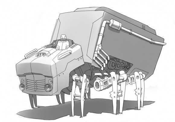
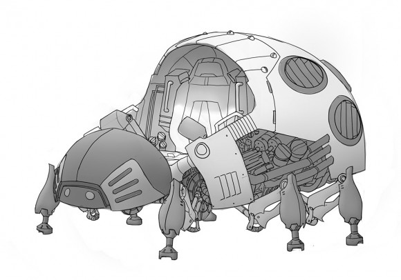
Fridge-bot & Ladybuggy

Concept art for two of the mecha that show up early in the film.

Concept art by Justin OaksfordConcept art by Justin Oaksford
Concept art by Justin Oaksford

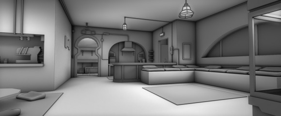
Pre-visualization environments

As much as I wish I could post some lavish, full-color renders of the final environments in the film, the angular, chunky models below will have to suffice for now. These are a few of the low-poly sets we’ll be using for pre-vis animation, expertly modeled by David Alvarez based on Vincent’s paintings. There’s one of these for every environment in the film.

The Ottoman's living room
The Ottoman's workshop
Models by David Alvarez

Behind the Tattoo

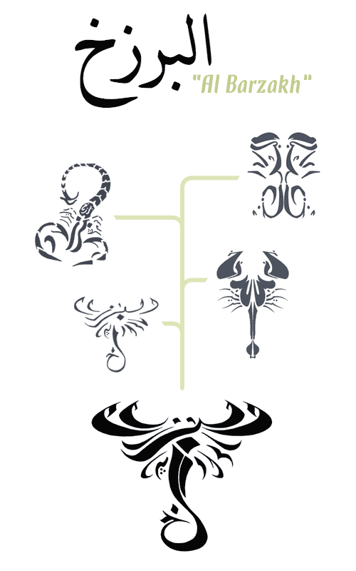
Below you can see the progression of the design of the Scorpion Rider’s tattoo. (The word it spells out is Al Barzakh, the veil between life and death.)

The designs on the right side were contributed by David Ward, drawn in a mirrored calligraphic style. The designs on the left are from Dhar Jabouri, who favored an asymmetric approach. The two artists traded ideas back and forth, eventually settling on the impressive treatment at the bottom.

tattoo-progression.gif

Gallery additions: workshop/living room

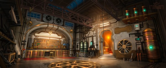
I’m thrilled to report that, with the addition of these two paintings of the living room and workshop, environment concept work on The Ottoman is officially complete. The series of paintings in the environment gallery represent all the locations in the short.

Artwork by Vincent Morin

Vincent has outdone himself with this richly detailed rendition of the Ottoman’s workshop. I can’t wait to see this environment recreated in 3D…